
Yousician had a great thing coming
I was the designer who needed to figure it out – Localization!
The thing was… we made the app for English specifically in mind. What did that mean? We had a problem… our pause menu needed a redesign.
The hypothesis: We could move less used items behind a button, we could move the pause menu to the top of the screen, and we could redesign screens that had UI issues.
The problem
Some screens such as notations have little explanation which causes confusion. The tempo widget is not used to its full extent. Most users only use the tempo slider.
Go through the app.
First thing was first. With my team, we decided to try and go through the UI elements of the Yousician app and find what might we encounter when we get real localized text in. This meant mocking up old legacy designs in Figma and using Google Translate (Pseudo-translations as we called them) to see what could happen.
Go through the data.
When we decided what might need to go and what we thought should stay, we went to the Data Chapter to get real, hard data.
Document problems.
To entice stakeholders, I created lots of documentation on Confluence with my Pseudo-translations detailing all of the problem children I found while going through the app. The main “issue” we seemed to come into problems with was the pause menu during main game play.
The proposed solutions
Overlay it
We could use a pause screen from a newer instrument with no changes. However, we know guitar players tend to pause the screen to see the notes.
Split it up
We can change this slightly by adding this bottom bar to move the options off the screen and lighten the cover to still show that it’s paused but they can still see under.
Improve it
We’ll need some of the popup style options like in voice. These are minimally redesigned for the simplicity of using existing elements so we can get localization to work quicker.
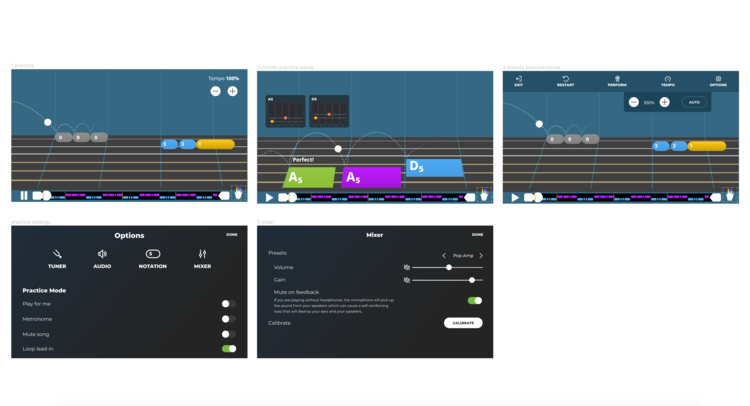
The end product
We had our pause menu redesign
After releasing the new menu, the changes by the users I most want to see are the accessibility to the tempo adjuster in practice mode and the understanding of the options they can adjust during practicing.
Before it was so cluttered and tight, ideas and add-ons were collected over time in the gameplay mode, added by developers over the years. Hopefully, with this reorganization and design, it will be a better flow from users.
“I had the pleasure to work with Lauren on the Localisation project and can attest to her design skills, professionalism, and positive attitude. Taking an English-only app and adding 6 languages is not an easy task, especially from the design point of view, raising issues in visual design and user experience. This requires communicating with many different stakeholders. Lauren made this look very easy and showed professional growth as this was one of her first projects as a Product Designer. The project checked all the boxes and this is in great part thanks to Lauren!
Even when not in the context of a specific project, Lauren is always happy to help her colleagues by user testing, reviewing and documenting. Not only does she help but she also initiates many a project on the company level to better the company culture. She is truly the beating heart of the company, making everyone feel welcome and included.
If you're looking for a person with a positive can-do attitude coupled with skills, I'd highly recommend Lauren!”
— Guillaume Jaskula, Senior Product Manager at Yousician